Nel 2015 partecipai a una gara per l’identità visiva della stagione lirica e concertistica del Teatro Comunale di Bologna, senza vincere.

Il concept

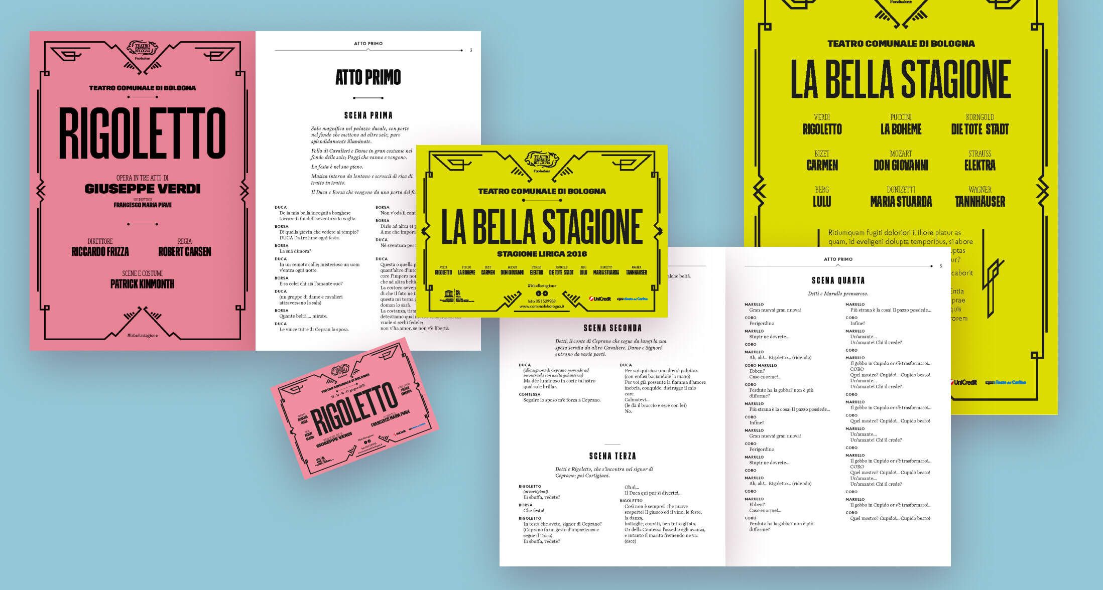
Ho esplorato l’estetica tipografica dei vecchi manifesti delle opere e dei concerti, basate su una grafica semplice, fregi, cornici e una accurata composizione.
Così ho lavorato su una identità visiva tipografica che rimandasse a quella tradizione, ma che fosse anche contemporanea.
I fregi quindi hanno angoli vivi, la grafica è vettoriale e le tinte piatte, il tutto ruota intorno ad un grande impatto visivo dato ai titoli delle opere inseriti in un contesto grafico razionale.

Le referenza storiche
Il visual della stagione
I manifesti delle singole opere
I libretti e i biglietti d'ingresso

Ipse dixit

Raffaela Canu

Head of design

Shopfully

I had the pleasure of working with Emanuele during a crucial phase of our company’s rebranding, and I couldn’t have asked for a better person to handle it. In just two months, he managed to roll out our new brand across all physical and digital touchpoints, ensuring everything was spot-on and consistent.

What really impressed me was how quickly he integrated into our team. It’s not easy to step into an already established group and hit the ground running, but Emanuele did it effortlessly. Super flexible, always proactive, and with an incredible ability to adapt, he made the whole process feel smooth—even when (not rarely!) challenges popped up.

On top of that, Emanuele brought so much energy and positivity to the team. His extroversion and great sense of humor made even the busiest days more enjoyable. If you’re looking for someone who’s not only talented but also a great team player and a joy to work with, I can’t recommend him enough!

Iniziamo?

Parliamo del tuo prossimo progetto, non vedo l'ora di iniziare.

Scrivimi